
Graphic design in 2026 is undergoing a decisive shift away from polished minimalism toward expressive, texture-rich styles that prioritize visual honesty and individuality. After years of clean lines and sterile uniformity, designers are embracing rough textures, asymmetry, visible grids, and 90s nostalgia to break through the sameness that has saturated digital platforms. This movement matters for musicians and music professionals because your visual identity competes in an increasingly crowded landscape where generic branding vanishes into the scroll.
The trend research is clear: multiple design authorities, including the Graphic Trend Report curated by Nandini Tiwari from Jumping Goose and analysis published in “Steal the start: 10 graphic design trends 2026” by Kittl, confirm that 2026 marks a pivot point. Audiences crave authenticity, and that craving shows up in design choices that feel human, imperfect, and culturally resonant. For Canadian artists building their brand or music industry professionals refining their visual messaging, understanding these emerging styles isn’t optional. Your album covers, social media presence, and promotional materials need to reflect the aesthetic values your audience responds to right now.
This guide breaks down ten specific graphic design styles gaining traction in 2026, explains the cultural context driving each trend, and shows you how to apply these approaches to strengthen your visual presence in the music industry.
Why 2026 Is Reshaping Graphic Design Styles
The visual landscape of 2026 reflects a collective exhaustion with sameness. After years of sleek minimalism dominating everything from tech startups to coffee packaging, designers and audiences alike are craving something more honest, more tactile, more human. This shift isn’t arbitrary, it’s documented across multiple trend analyses that reveal a coordinated movement toward expressive, unpolished aesthetics.
The Graphic Trend Report curated by Nandini Tiwari from Jumping Goose, which forms the foundation of Digital Synopsis’s article “Top 20 Graphic Design Trends For 2026,” identifies visual honesty as the central theme of the year. Kittl’s “Steal the start: 10 graphic design trends 2026” reinforces this observation, while the Behance project “Design Trends 2026” explicitly names the qualities defining this moment: rough textures, asymmetry, visible grids, and 90s nostalgia.
What makes these analyses particularly valuable is their convergence. When independent trend researchers from different platforms identify the same patterns, it signals a genuine cultural shift rather than a passing fad. The movement toward visual honesty isn’t designers chasing novelty; it’s a response to audiences who’ve grown tired of sterile perfection and yearn for work that feels real.
For musicians and music professionals, this context matters. The styles emerging in 2026 aren’t just aesthetic choices, they’re tools for building authentic connections with audiences who value creative risk over safe conformity. The ten styles we’ve selected reflect this broader movement, chosen because they represent practical approaches to visual identity that align with how Canadian artists are already thinking about their work: honest, expressive, and rooted in genuine creative vision.
1. Rough Texture and Tactile Surfaces

Rough texture isn’t new to design, but in 2026 it’s shedding its role as decoration and becoming a statement. Designers are layering grain, noise, paper stock simulations, and scanned analog materials to push back against the digital flatness that’s dominated screens for years. This shift toward tactile surfaces creates visual friction, your eye catches on the surface rather than gliding past it.
For musicians, this style translates directly to album artwork that feels like something you could touch. Think grainy photographic overlays on cover art, letterpress-inspired typography for band names, or distressed textures that mimic screen-printed posters from independent venues. These elements suggest a physical artifact even when the image lives entirely online, which resonates with audiences craving authenticity in an oversaturated digital landscape.
The technique works particularly well for merchandise design. A t-shirt graphic with deliberately rough edges and visible halftone dots reads as hand-crafted rather than mass-produced, aligning with the values of fans who support independent artists. Concert posters benefit from the same approach, scanned paper textures, ink bleeds, and imperfect registration create the impression of limited-run prints, increasing perceived value and shareability on social platforms.
When working with a designer, specify which kind of texture serves your sonic identity. Lo-fi bedroom producers might lean into VHS grain and photocopy artifacts, while roots musicians could choose canvas weaves or vintage print textures. The key is matching the visual roughness to your musical aesthetic, not applying texture arbitrarily.
2. Asymmetrical Layouts and Dynamic Composition
Asymmetrical layouts disrupt the visual equilibrium that designers relied on for decades. Instead of centering headlines, balancing columns, or distributing elements evenly across a page, this approach deliberately shifts weight to one side, leaving empty space as an active design element rather than something to fill. The result feels urgent, spontaneous, and harder to ignore.
This technique works by creating visual tension. Your eye wants to resolve the imbalance, so it keeps moving across the composition, discovering information in a non-linear sequence. A poster for Canadian music festivals might push the headliner name to the bottom-right corner, place the date vertically along the left edge, and leave the top half nearly blank except for a single graphic accent. The unconventional hierarchy forces viewers to pause and process the information differently than a centered, symmetrical layout would allow.
For social media graphics, asymmetry helps content stand out in crowded feeds. A square Instagram post that aligns all text and imagery to one quadrant, leaving three-quarters breathing room, reads as confident rather than incomplete. Artist branding benefits when asymmetrical compositions carry through album covers, tour posters, and website headers, building a recognizable visual language that feels less corporate and more human-made.
The risk is incoherence. Without an underlying structure, asymmetrical layouts collapse into randomness. Successful designers still work from a grid, they just choose to violate it intentionally. The imbalance needs purpose, guiding attention, emphasizing a specific element, or creating rhythm across a series of designs.
3. Visible Grid Systems
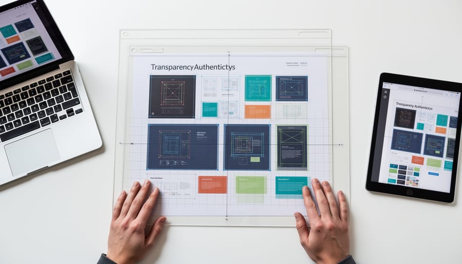
Visible grid systems turn the invisible scaffolding of design into a deliberate, prominent feature. Rather than hiding the structural framework that organizes content, this style exposes columns, baseline grids, and alignment guides as visual elements themselves, often rendered in contrasting colors, dotted lines, or overlaid transparencies. The effect is a layered composition that reveals how the design was constructed, pulling back the curtain on the creative process.
This transparency resonates with audiences who value authenticity and reject overly polished aesthetics that feel manufactured or impersonal. By making the grid visible, designers signal honesty about their craft: you see not just the finished product but the system of decisions that shaped it. For musicians and music organizations, this approach works particularly well in contexts where process matters, limited edition vinyl packaging, behind-the-scenes campaign materials, or visual identities for independent labels and artist collectives that emphasize collaboration and craft over commercial slickness.
Visible grids create visual rhythm through repetition and structure, which mirrors the compositional discipline of music itself. They also provide a framework for organizing complex information, tour dates, festival line-ups, album credits, without sacrificing visual interest. The technique pairs naturally with bold typography and asymmetrical layouts, allowing designers to balance rigorous structure with dynamic energy. When executed well, exposed grids communicate both technical competence and creative confidence, showing that the designer knows the rules well enough to make breaking or revealing them a deliberate choice rather than an oversight.
4. 90s Nostalgia and Retro Revival
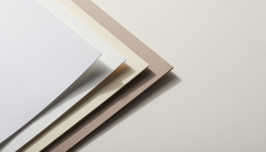
The 1990s are back, and this time the revival isn’t subtle. Designers in 2026 are pulling chunky sans-serif type, day-glo color palettes, and grainy textures straight from the decade that gave us grunge, rave culture, and the early web. What makes this trend resonate isn’t just nostalgia, it’s the emotional weight those aesthetics carry for multiple generations at once.
For audiences who lived through the 90s, these visuals trigger genuine memory and connection. For younger viewers raised on digitally curated feeds, the analog imperfections feel refreshingly honest and tactile. That dual appeal makes 90s-inspired design especially powerful in music marketing, where emotional resonance drives engagement.
Think album covers with warped VHS scan lines, tour posters using pixel fonts and neon gradients, or merchandise featuring comic-book halftones and off-register printing effects. The style works because it references a specific cultural moment when music and visual identity were inseparable, when you bought the CD for the liner notes as much as the songs.
The key is authenticity over parody. Designers are mining the era’s experimental energy and DIY spirit, not just copying its surface quirks. When applied thoughtfully to artist branding or campaign materials, 90s aesthetics communicate creative independence and a rejection of overly polished corporate design, qualities that align perfectly with independent music scenes and artists building genuine connections with their audiences.
5. Visual Honesty and Unpolished Aesthetics
Visual honesty strips away the glossy veneer that dominated digital design for years. Instead of airbrushed perfection, this style celebrates visible brushstrokes, uneven edges, and the subtle imperfections that prove a human created the work. The Behance Design Trends 2026 project identifies this embrace of raw visual language as a defining shift, moving toward authenticity over polish.
This approach resonates with audiences tired of identical templated graphics and AI-generated sameness. Hand-drawn lettering that wobbles slightly, scanned textures with visible paper grain, illustrations with eraser smudges left intact, these elements signal genuine creative effort. For musicians building a visual identity, this style communicates artistic integrity without needing to explain it.
The connection to broader transparency principles isn’t accidental. Just as artists demand clarity about rights and royalties, audiences increasingly value seeing the process behind creative work. A poster design that shows construction marks or pencil guidelines demonstrates confidence in the work’s humanity.
Visual honesty works particularly well for independent musicians and grassroots music organizations. Album artwork featuring watercolor bleeds, collaged zine elements, or hand-lettered track listings distinguishes your release from sterile corporate design. The imperfection becomes the signature, turning what previous generations would have considered production flaws into deliberate artistic choices that strengthen connection with listeners who value authenticity above perfection.
6. Expressive Typography
Typography dominates visual hierarchies in 2026, transformed from a supporting player into the star of the composition. Designers now treat letterforms as sculptural objects, stretching, warping, and animating type to convey mood before a single word is read. Variable fonts, which shift weight, width, and slant along customizable axes, let designers fine-tune typographic personality with precision impossible in static typefaces. A single variable font file can morph from delicate to aggressive, matching the emotional arc of a track or campaign.
Experimental letterforms break conventional readability rules deliberately. Characters overlap, rotate off-axis, or fragment across compositions, creating visual rhythm that mirrors sonic patterns. This works especially well for electronic producers, hip-hop artists, and experimental musicians whose sound already challenges traditional structures. The type itself becomes a visual signature, as recognizable as a logo.
Kinetic typography, text that moves, pulses, or responds to sound, bridges print and digital channels. Social media teasers, lyric videos, and website headers use animated type to grab attention in crowded feeds. The motion doesn’t just decorate; it amplifies meaning, syncing typographic movement to musical beats or lyrical phrasing.
For musicians building identity systems, expressive typography offers immediate differentiation. Custom lettering for artist names, album titles, or tour branding creates ownable visual assets that fans recognize instantly. The key is alignment: aggressive blackletter suits metal or hardcore, fluid scripts match R&B or soul, deconstructed sans-serifs reflect avant-garde electronica. The type should sound like the music looks.
7. Bold Color Clashing
Bold color clashing throws out the traditional rulebook of harmonious palettes. Instead of safe, complementary combinations, this style pairs colors that shouldn’t work together, electric lime with hot magenta, deep purple against vibrant orange, neon yellow clashing with cobalt blue. The result creates immediate visual impact and stops scrolling thumbs in their tracks.
This approach reflects the broader shift toward visual honesty identified in the Behance Design Trends 2026 project. Where minimalism favored muted, neutral tones that blended seamlessly across platforms, bold clashing demands attention and refuses to be ignored. High-contrast palettes communicate energy, confidence, and a willingness to break convention, qualities that resonate with audiences tired of sameness.
Festival branding has embraced this style with particular success. Posters, wristbands, and stage visuals use jarring color combinations to create memorable experiences that photograph well and stand out in crowded social feeds. Digital campaigns benefit too: Instagram stories, YouTube thumbnails, and Spotify Canvas animations gain stopping power when colors collide unexpectedly.
For musicians and music organizations, this style works best when it aligns with your sonic identity. If your music is loud, experimental, or genre-defying, bold clashing reinforces that personality visually. The key is intentionality, these combinations should feel deliberate, not accidental. Work with designers who understand color theory well enough to break it strategically. Test palettes against your existing brand elements to ensure the clash creates excitement rather than confusion.
When applied thoughtfully, color clashing becomes a powerful tool for differentiation in an increasingly crowded visual landscape.
8. Collage and Mixed Media
Collage and mixed media techniques layer photography, illustration, hand-drawn elements, texture, and typography into a single composition, building visual depth that flat design cannot achieve. This approach treats the canvas like a storyboard, where each element contributes a fragment of narrative. Musicians benefit from this style because albums and singles often carry conceptual themes that demand more than a single image can convey. A collage can juxtapose concert photography with vintage textures, custom lettering with abstract shapes, creating a visual language that mirrors the complexity of the music itself.
The technique works particularly well for tour announcements, album packaging, and social media campaigns where storytelling unfolds across multiple touchpoints. Designers using Figma for musicians can build layered compositions collaboratively, adjusting elements in real time as the artist’s vision evolves. Collage also solves a practical problem: it allows artists to incorporate diverse visual assets without forcing stylistic uniformity. A photograph from rehearsal, a sketch from the songwriting process, and a typographic treatment of the song title can coexist if layered thoughtfully.
When licensing imagery for collage work, pay attention to music licensing rights principles that apply equally to visual content. Stock photos, commissioned illustrations, and found textures all carry usage terms. The strength of mixed media lies in its ability to combine the personal with the polished, creating visuals that feel both intentional and spontaneous.
9. Hand-Drawn and Illustrative Elements
Hand-drawn and illustrative elements bring a human touch to digital design that stock imagery and template-based graphics simply can’t match. In 2026, as the industry moves away from polished minimalism, custom sketches, doodles, and original illustrations communicate personality and creative authenticity in ways that resonate with audiences tired of visual sameness.
For musicians and songwriters, hand-drawn elements work particularly well in album artwork, social media posts, and merchandise designs where character matters more than corporate polish. A custom-illustrated gig poster feels intimate and handcrafted compared to yet another photoshopped template, while sketched lyric graphics on Instagram create warmth and accessibility that deepens fan connection.
The power of this style lies in its imperfection. Visible pen strokes, uneven lines, and spontaneous marks signal that a real person sat down and created something specifically for this project. That authenticity carries weight in music branding, where genuine artistic expression matters more than technical perfection.
You don’t need advanced illustration skills to start, simple line drawings, hand-lettered text, or even scanned notebook doodles can elevate your visual identity. If you want to develop these skills yourself, consider exploring an online graphic design program that includes foundational drawing and illustration modules.
Working with an illustrator who understands your musical style can also transform your branding from generic to genuinely distinctive, creating visual assets that feel as original as your music.
10. Brutalist and Anti-Design Approaches
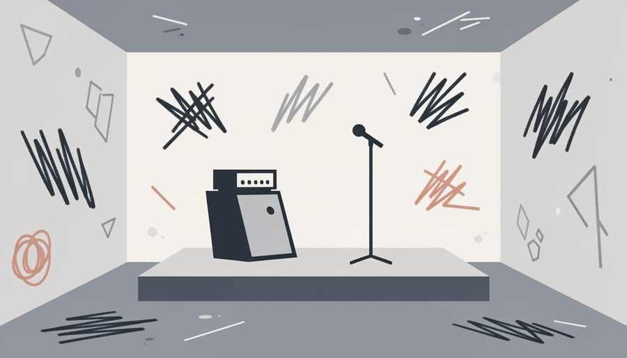
Brutalism in graphic design takes its name from Brutalist architecture, concrete structures that reject ornamentation in favor of exposed materials and stark functionality. In 2026, this approach strips websites, posters, and digital campaigns down to their essential components: plain backgrounds, system fonts, minimal color, and deliberately awkward layouts that break conventional design rules. The aesthetic is confrontational. It refuses to charm or seduce. Instead, it demands attention through rawness and honesty, rejecting the polished surfaces that dominate commercial design.
For independent musicians and underground music scenes, Brutalist design offers a visual language that aligns with countercultural values. Punk, experimental electronic, and DIY artists have adopted anti-design approaches for album covers and tour posters that feel urgent and uncompromising. The style communicates authenticity by showing the scaffolding: unpolished typography, exposed HTML elements, intentional visual discomfort. It’s design that doesn’t apologize.
This approach works when your music itself challenges norms or occupies a confrontational space. If your sonic identity is experimental, abrasive, or intentionally outside the mainstream, Brutalist visuals reinforce that position. The risk is alienation, this style repels as often as it attracts. Use it deliberately, not as a shortcut to edge. When aligned with genuine artistic intent, anti-design becomes a powerful statement of independence, stripping away everything except what matters: the work itself and the audience willing to engage with it on its own terms.
Applying These Styles to Music Industry Visuals
Start with clarity about what you need, then find a designer who understands music culture and can translate your artistic vision into visual language. The strongest collaborations happen when musicians bring mood boards, reference tracks, and honest descriptions of the feeling they want to create rather than prescriptive design instructions.
These graphic design styles work across every visual touchpoint musicians encounter:
- Album artwork that communicates genre, mood, and artist identity at thumbnail size
- Social media templates for consistent visual presence across platforms
- Tour posters and event graphics that capture attention in crowded feeds
- Merchandise designs that fans want to wear and share
- Website design that reflects your sonic aesthetic
- Press kits and promotional materials that convey professionalism
Your sonic identity should guide your visual choices. If your music is raw and unpolished, brutalist or hand-drawn styles might align better than slick minimalism. If you’re creating layered, complex soundscapes, collage and mixed media could mirror that depth visually. The style itself matters less than the coherence between what people hear and what they see.
Work with designers who ask questions about your music before showing you mockups. Share your influences, your audience, your creative process. A designer applying rough textures to folk music needs different reference points than one using the same style for experimental electronic work. Regional context matters too, Canadian artists often balance international design trends with distinctive local visual languages that set them apart in global markets.
Budget constraints don’t mean settling for generic templates. Many designers offer tiered packages, and focusing resources on one or two strong assets beats spreading thin across everything. A compelling album cover can carry your visual identity while you develop other materials over time.
Common Questions About Graphic Design Styles in 2026
What’s driving the shift away from minimalism in 2026?
As visual sameness grows across digital platforms, designers and audiences are rejecting the polished, corporate aesthetic that dominated the 2010s. The Behance Design Trends 2026 project identifies a movement toward visual honesty, rough textures, asymmetry, and expressive elements that feel authentic rather than manufactured.
How do I choose the right graphic design style for my music brand?
Start with your sonic identity and the emotions your music evokes. A punk band might lean into brutalist approaches or hand-drawn elements, while an electronic producer could explore expressive typography or bold color clashing. The style should amplify your artistic vision, not compete with it.
Can these graphic design styles work together in one brand?
Yes, but with intention. Mixing rough textures with 90s nostalgia creates layered visual storytelling, while combining asymmetrical layouts with visible grids shows both spontaneity and structure. The key is maintaining a consistent emotional thread, coherence comes from shared attitude, not identical techniques.
How do Canadian artists incorporate international design trends while maintaining local identity?
Draw from global movements like the ones identified in the Graphic Trend Report curated by Nandini Tiwari from Jumping Goose, but filter them through distinctly Canadian elements, bilingual typography, Indigenous design principles, or regional cultural references. International styles provide the vocabulary; your local context provides the message.
Do I need to follow all the latest graphic design trends?
No. Trends offer options, not mandates. Choose styles that genuinely reflect your artistic identity and resonate with your audience. A timeless, well-executed approach that aligns with your music will always outperform trend-chasing that feels forced or inauthentic.
These questions reflect the practical concerns musicians face when building visual identity systems. Many independent artists work with limited budgets and need to make strategic choices about where to invest design resources. Understanding the cultural context behind these 2026 trends helps you communicate more effectively with designers and make decisions that strengthen rather than dilute your brand.
The shift toward expressive styles also opens opportunities for collaboration with emerging designers who are experimenting with these approaches. Canadian design schools and creative communities are producing talent steeped in both international trends and local sensibilities, creating a rich pool of potential collaborators who understand how to balance global aesthetics with regional authenticity.
The movement toward visual honesty and expressive graphic design styles in 2026 reflects something larger than aesthetics. It signals a cultural shift away from the polished uniformity that dominated the 2010s and early 2020s, toward work that feels genuinely connected to the people and stories behind it. For Canadian musicians and songwriters navigating an increasingly crowded global market, these styles offer more than trendy templates, they provide frameworks for building visual identities that resonate with authenticity and stand apart from algorithmic sameness.
The ten styles explored here, from rough textures and asymmetrical layouts to brutalist approaches and 90s nostalgia, aren’t prescriptions. They’re tools. The question isn’t which trend to follow, but which visual language genuinely serves your music, your message, and your connection with listeners. A folk artist working with hand-drawn elements communicates something fundamentally different than an electronic producer using bold color clashing, and both choices can be equally valid when they align with the sonic and emotional core of the work.
Canadian artists have always balanced local identity with international reach. The design styles shaping 2026 create space for that duality: embracing visual honesty means you can honor regional influences, DIY roots, or collaborative processes while still speaking to global audiences hungry for substance over surface. Your visual identity shouldn’t dictate your artistic direction, it should reveal it. Let the design serve the vision, not the other way around.